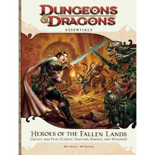
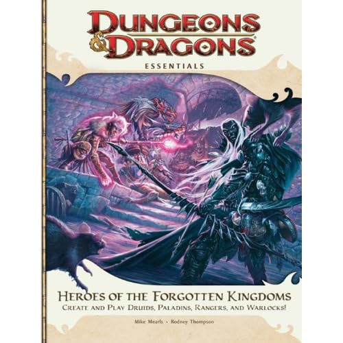
They're much "busier."
The PH1/2/3, DMG2, Dungeon Delve, and Eberron Player's Guide, all follow a "two characters" format. The Dark Sun Campaign Guide will be doing this, too, with what I think is the most awesome cover ever. There's a male and female character on each cover, in the foreground. The DMG1, MM1/2/3, all of the Power books, Open Grave, and Draconomicon 1/2 all focus on a single character. (Some of the Power covers have activities/characters that are essentially background, though.)
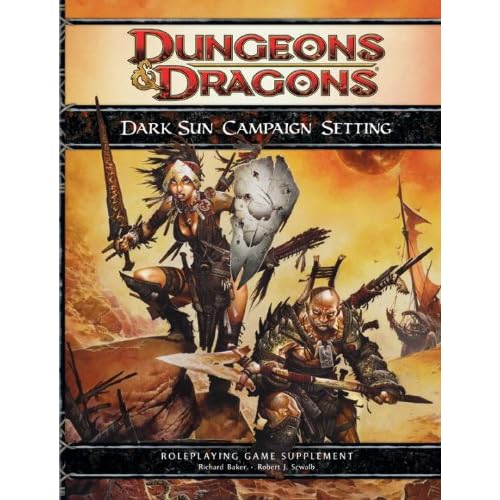
But the Heroes of covers are busy. Characters running, casting, fighting, at different layers, with a high level of detail put into every character and each stone in the wall. The Power books might have had action and other characters, but they weren't that well-defined, so they were background.
Personally, I dislike this. It's a distracting cover. I'm not going to be as quick to spot the title or notice the caption. There's no particular character that I can identify with the book, either. If I'm going through my books, I notice my DMG2 because of the guy with the weird axe. He's a character, well defined, one of two I could notice on the cover.
I don't just think the simpler covers look better when they're sitting out. They're distinct. They're something that will stand out and leave a lasting impression. A friend noticed Dungeon Delve on my table, and I started telling her about D&D. We go shopping, there's a copy of Dungeon Delve on the end of the shelf with the cover facing out, she recognizes it. It's a simple but easily identifiable cover.
Will this keep me from dropping $14 to get a Heroes of book for a new player? No. Will it keep me from buying a copy for myself? If the content isn't knock-my-socks-off impressive, I'd skip it. I really like the idea behind Essentials, and Fallen Lands looks like it has the races and classes I identify D&D with the most, but if it doesn't have enough for me as an established player and it's not pretty, it's not going on my shelf.
What about you? Are there particular covers you really like, and why?
Consistent covers was one of the thing I really loved about the 3.5 Eberron books - they all look awesome together.
Except Races of Eberron. But I hated that book anyways.

The more I look at these, the more interested I am in them.
I like these new covers! Honestly, as much as I like WAR's artwork, and even though I like 4E's covers much more than I did 3E's, I still find this "two people standing around" pattern to be dull.
This. Give me an actual scene with stuff happening over a "portrait" (even if it's a portrait in a cool environment) any time.
According to the covers, the inclusion of Ranger in Fallen Lands and Cleric in Forgotten Kingdoms seems to be dropped. Interesting.
Hrm? According to the cover images linked, Rangers are in Forgotten Kingdoms, and Clerics are in Fallen Lands. That matches the summaries on the product pages.
According to the covers, the inclusion of Ranger in Fallen Lands and Cleric in Forgotten Kingdoms seems to be dropped. Interesting.
Hrm? According to the cover images linked, Rangers are in Forgotten Kingdoms, and Clerics are in Fallen Lands. That matches the summaries on the product pages.
I believe he's referring to the fact that at some point, Clerics and Rangers were both listed for both books, IIRC. I definitely remember reading a list of five classes in each, once upon a time.
Perhaps it was an error from the beginning.
According to the covers, the inclusion of Ranger in Fallen Lands and Cleric in Forgotten Kingdoms seems to be dropped. Interesting.
Hrm? According to the cover images linked, Rangers are in Forgotten Kingdoms, and Clerics are in Fallen Lands. That matches the summaries on the product pages.
I believe he's referring to the fact that at some point, Clerics and Rangers were both listed for both books, IIRC. I definitely remember reading a list of five classes in each, once upon a time.
Perhaps it was an error from the beginning.
Product descriptions on both Amazon and WotC's product catalog still include Rangers in Fallen Lands and Clerics in Forgotten Kingdoms. Also, hard to see, but both covers say "Iconic races and classes for all players" on the cover instead of a list of included classes in WotC's product catalog.
As for the illustrations, I really like the Fallen Lands cover. Not so much for the Forgotten Kingdoms, but that's because I'm not sure I like the color pallet against the beige framing, not that I have a problem with how busy it is.
While all the action might make it longer for someone to find the title, I think the goal should be a cover that catches their attention and causes them to go "Woah, cool! I wanna do that!" We all might get excited when we see a new cover, but that's because if we can decipher it, we'll have a better idea of the races and classes inside, not because it's exciting by itself.
Product descriptions on both Amazon and WotC's product catalog still include Rangers in Fallen Lands and Clerics in Forgotten Kingdoms. Also, hard to see, but both covers say "Iconic races and classes for all players" on the cover instead of a list of included classes in WotC's product catalog.
So they do. The question here is: who has the out of date images? Amazon or WotC? I would probably trust the Product Catalog over Amazon's images in that case.
So the hope of 2 new Ranger and 2 new Cleric builds amidst the Essentials is not dead yet then. That's good.
So they do. The question here is: who has the out of date images? Amazon or WotC? I would probably trust the Product Catalog over Amazon's images in that case.
So the hope of 2 new Ranger and 2 new Cleric builds amidst the Essentials is not dead yet then. That's good.
You mean you would trust the slow to update product catlagoue over the place that tends to get new product solicitations before everyone else? Frankly I think the Amazon cover is more likely the actual cover.

In fact, I found a website that still shows the old cover: [Link]

I remember when the Wizards site had the "old" PHB cover for months even after Amazon was displaying the one that actually went to print. The old PHB cover art was used later for Dungeon Delve.
In fact, I found a website that still shows the old cover: [Link]
I liked that cover better. The artwork for Dragonborn still needs refinement, I think.
As for Amazon vs WotC, don't forget that Amazon was still accepting orders for "D&D Icons: Gargantuan Orcus" eight months after it was officially put "on hold"... Perhaps they knew it was forthcoming two years late anyway?
But yeah, Amazon has a better overall track record of updating product info than does WotC.
If the first Player's Handbook had a cover as pleasing as the Heroes of the Fallen Lands piece, I probably would have purchased several more as gifts for friends. As it happened though, the cover was hideous.
That's not to say I dislike Wayne Reynolds' work in general - some of it is great. In particular, his DMG cover was awesome. I've reached a saturation point for covers involving one or two silly looking characters adorned in freakishly unwieldy weapons and posing awkwardly, however.
This new style is a welcome, welcome change, and cutting down on the hyper-defined, super-contrasty lines saves my eyes some pain in the long run.
(As for the Forgotten Kingdoms cover art, I think I'm okay with the image being somewhat discordant with the borders. It's the book with all the weird stuff, after all.)
...and if we're female assume a painful spine-shattering T&A pose'.)
Speak for yourself, Nai!! ;)
myth: that pose would shatter a spine
tonight on mythbusters
myth: that pose would shatter a spine
+1
tonight on mythbusters
myth: that pose would shatter a spine
Nah. They always use dummies to model myths that involve bodily harm. If they were testing the pose (and similar ones) with a real model (with bodily proportions as close as possible to woman in D&D artwork), you could count me in.