Considering I used the 3e books and most of the art repulsed me, I don't think the art effected my like or dislike of the system at all. I just accepted that I hated the art and moved on.
I really like the art
Less cartoony and more pastel than gloss......and thankfully much better scaled weapons and less flesh on display
The art has been fantastic. People criticising it are welcome to say that they don't like it but saying that it's not good is like saying a Bentley is cheap.
I love the cover art and the full page action scenes appearing elsewhere. I am an advocate of "realism" though so I hate the out of proportion art from 3e/PF.
I strongly dislike though some of the internal art like the warlock and the dwarf. The dwarf is heinous in my opinion.
Art would never ever affect my purchase of a game. I would take stick figures everywhere if they'd remove second wind.
"How do you constantly use books with art that repulses you without it impacting how you feel about the game?"
Desensitization. I find I don't notice most of the art after the first few times seeing it.
No matter how much you dislike it wildboar, it will, in my experience, cease to matter after a few months with the books.
Give it time.
(I like the art personally, but I thought I'd do something wacky and actually answer the question the OP was asking.)
akaddk wrote:
I didn't like 4e art at all (except for a few pieces). Loved the game though. The art for DDN is a bit more my style, better than 3e (which was not spectacular but not bad). The art from 2e was easily my favorite (love Elmore, the Dragonlance stuff --just screams D&D to me).
I can sympathize about the artwork really discouraging (rather than inspiring).The style used for Pathfinder (while professional) is a big reason why I've never given that game a fair chance. Just . . . does nothing for me (and I feel like it prolly should, ya know?).
I've not seen outragiously overly-large weapons being weilded yet, so I'm good so far.
frothsof wrote:
I actually have a soft spot in my heart for the old black and white crude drawings. As a kid, those always fasicnated me. I also always loved the black and white drawings in the Steve Jackson fighting fantasy books. That art, while simple, sparked my imagination and let me fill in all of the gaps.
I know that in the modern day, simple black and white drawings wouldn't really cut it, but sometimes I do miss that kind of stuff.


Having said, that, I really like the art in 5E. Since it is full color and richly detailed art, I like that it is realistic rather than cartoony.
I really like how the Starter Set box art is a modern piece, but is a throwback to the original Red Box with a fighter holding his sword and sheild near the mouth of a dragon. I thought this was a nice touch and a cool way to keep the theme of the original basic set art in tact.
I agree with what everyone else said about playing something when you don't like the art. After a little while, you won't notice it anymore as you'll eventually be desensitized to it if it is bothering you.
During the 1e years I just ignored all the horrible art and played the game.
Paraxis wrote:
Emerikol. wrote:
I think 5E's artwork is pretty niice so far
I am a big fan of the oldschool art in the 1st Edition books. As far as more modern style art goes, I think what has been revealed so far is just fine.
I've been generally pleased with the 5E art as well. It strikes a nice balance between the realistic/historic side and the over-the-top anime/fantasy art that is so popular.
I would like it even more had it been MORE historical. With realistic hammers (the giant hammers we've seen so far would be useless in real life) and armor that looks like it actually came from the middle ages. Still, I think they went the right direction for mass appeal.
I'm finding 5e art to be "okay" so far.
It's has some good and some bad stuff... but although the good isn't awesome, the bad isn't awful either.
It doesn't come near the days of the great artists in D&D such as Brom, Caldwell and Parkinson...
...but it sure beats 3e's "anime-ish" style, Pathfinder's "totally anime" style, and 4e's outright "5 year old little girl drawing" style.
Some of the 5e art like the female dwarf still feels anime-ish to me (although technically speaking it is very well drawn and painted), but much less than 3e, PF or 4e... but some of the art like the Ogre and the cover of the Starter Set I really like a lot.
Artifact wrote:
I love almost all the Fifth edition art I've seen so far, except for the picture of the warlock we saw in one preview. As the OP's question of how to deal with art you hate in an edition, well I hated some of the first editions' art that was kind of cartoony in the first monster manual and Fiend Folio (liked some of the art though). I loved some of the second edition art. I disliked much of the third edition art. But these days as DM I don't need to depend on the art provided in the official books. In my games I like to project art for locations, monsters and NPCs and I collect hundreds or thousands or art images and photos in my computer and organize them so I can call them up when needed. I put the art up for my players to see at the right times on a flat screen TV in the game room (used to use my laptop screen which I would turn to face them when I wanted to show something). There is so much amazing free fantasy art available for free on the internet you can create the feel for your own games using art you like.
I think it's fine. Art's not a big draw for me as far as a game goes. Rules that support the intended game experience are what I'm into.
The torn pages/ ink blot look for backgrounds and edging is a little weird, as is the overlap. It looks weird. That's going to take a little getting used to, and I think they're overdoing the usage a little. I expect that will go the way of the weird art of the 3e PHB and be replaced quickly in later books as it becomes problematic to maintain.
The dwarf picture isn't that bad. It's not a great shot book looks okay. Reasonable armour, no boob window or cleavage, no oversized weapons. It's not remarkable but inoffensive.
IMHO, the art of 5e is pretty good. I disliked much of the 3e art (the armor looked like leisure suits), and disliked some of the 4e art for having oversized weapons and unrealistic armor. What I've seen from 5e so far is pretty good. The Warlock was not so good, but the Ogre was great.
dmgorgon wrote:
wildboar wrote:
dmgorgon wrote:
Azzy1974 wrote:
I'm not super thrilled about the 5e art so far. A lot of the interior stuff looks more "realistic" than the past couple of editions in a sort of boring way, IMO.
I liked a lot of the 4e stuff as long as it wasn't William O'conner, and i think 4e gets blamed for a lot of the "cartoony" complaints because of him. I cringed every time is saw him attempt any kind of anatomy.

I think overall the edition that has the most conistant level of art that i like is Pathfinder.
Azzy1974 wrote:
Azzy1974 wrote:
ChrisCarlson wrote:
AaronOfBarbaria wrote:
I would actually prefer minimal or no art for everything except the races and the monster manual. It increases the length and price of the books without adding anything, and often leads to terrible formatting. There's a reason why
I've removed content from this thread. Trolling/baiting is a violation of the Code of Conduct
You can review the Code of Conduct here: company.wizards.com/conduct
Please remember to keep your posts polite, on topic and refrain from personal attacks. You are free to disagree with one another as long as it is done in a respectful manner.
docdoom77 wrote:
Person_Man wrote:
Rastapopoulos wrote:
I'm okay with it. 3E art was the utter low point for me. 4E started to come back, but the oversized weapons and teh really long elf ears (WHY?!?!?!?!) I still hated. Early 2E art was probably my favorite.
While there is definitely some anime influence out there, I think anime is mostly just a hugely popular internet scapegoat. Whenever something is stylistic as opposed to "realistic" it often automatically gets tagged with "anime" even if it doesn't resemble it at all.
I grew up in the 80s with He-man, long before final fantasy 7 and "OMG animu giant weapons!", and what did we have? A fantasy world where people had all kinds of wacky giant weapons.I also saw plenty of other fantasy art by the likes of Frank Frazetta with oversized weapons like we have in modern d&d art, and he was doing it before anime was.
I have no doubt that if the 1982 he-man came out for the first time today, it would be criticized for being "too anime", even though it's weapons and style predates all of the anime stuff.
wildboar wrote:
GhostStepper wrote:
I love 4th edition art and to me it's the best to date. The covers for the upcoming 5th edition books are epic and very, very sharp. Some of the art of 5th edition is for sure not to my taste (the dwarf in mind) but overall it is of high calibre.
docdoom77 wrote:
The 5E art has been decent, better than the 4E art by a long shot which was occasionally painful to look at.
The main difference seems to be 5E art has more shading and looks blurrier where as all previous editions had pretty distinct outlines and simple (or no) shading. But that is just a taste issue.
If you look at the female dorf (without beard) you see the emblems on her shoulder pads don't quite look like they're positioned properly and you sort of wonder if it's magic holding her thigh guards on. But small points that only come up because of the amount of detail and compared to 4E art, the fact that her arms are attached to the proper points on her body and aren't thicker than her torso makes it head and shoulders better art.
That said... I'd rathere there was no art. It just slows me down looking up rules. Stick the art in Dragon Magazine along with some ads for things I've never heard of but could be interested in and toss in some ecologies and I'll buy it.
Paraxis wrote:
So far the only piece of 5e artwork I have disliked is the halloween warlock. All of the other art has been fantastic.
Rastapopoulos wrote:
Azzy1974 wrote:
docdoom77 wrote:
ChrisTheS wrote:
docdoom77 wrote:
ChrisTheS wrote:
Rastapopoulos wrote:
Azzy1974 wrote:
Personally, I suspect the oversized equipment schtick has less to do with JRPGs and more to do with Games Workshop and their fascination for massive spiky shoulderpads and grotesquely exaggerated facial expressions.
ChrisTheS wrote:
Possibly because Warhammer isn't meant to be generic. It has a well-defined and established style which all the art conforms to. D&D art has never had much of a unified style, so if something in particular isn't to your taste it tends to stand out more.
(Now, I personally have never looked at a piece of D&D art and been disgusted by it, so I don't get why other people seem to be so bothered.)
ChrisTheS wrote:
ChrisTheS wrote:
ChrisTheS wrote:
docdoom77 wrote:
GhostStepper wrote:
Azzy1974 wrote:
Okay, so I've seen about 3-4 threads talking about all these art previews, butI can't find them anywhere. Where is all this stuff being posted?
And if it is Twitter could someone repost them in the forums so those of us who don't do that sort of thing can know what you guys are talking about?
ChrisTheS wrote:
FFSAA wrote:
An anecdote about tolerating unpleasant art...
The Rules Cyclopedia, the only version of D&D to be contained in a single hardcover volume, is my favorite D&D book, ever. It has almost all of the BECMI rules from the older boxed sets in a well-organized, easy to reference format.
The art is atrocious. I winced when I first opened it and continue to wince whenever I reference it. But its still my all-time favorite D&D book.
I just trained my eye to bypass it. If something is otherwise awesome, you can learn to work around a single flaw (even if its a glaring one, like art).
Azzy1974 wrote:
I love the new art, best art I've seen since 2e
Warder
I like the art. I like the depiction of the action; nothing looks to hokey or distorted. But, to each his own.
I would be interested in what type of art would the OP like to see?
I've liked the Art so far. Though I agree about the dwarf female, but can't really explain why I don't like it. I guess its the way she is standing.
If I may sidetrack the discussion slightly for a diatribe on art history  :
:
If you do some google image searches for fantasy art, anime art and western animation art by decade, you can actually see a fairly clear progression of anime being influenced by western art styles rather than the other way around. I've observed that the style of Japanese media tends to parallel western developments fairly closely, but with a delay of about 8-15 years in most cases (for instance, most anime of the 1990s looks like the American cartoons of the 1980s, while tokusatsu shows of the 2000s more closely resemble American and British sci-fi and fantasy shows produced between 1988 and 1995 than they do to any contemporary American shows). It's only been in the last decade or so that the two have achieved general parity. What's especially interesting is that the evolution of western art is more of a continuum, with minor changes between eras (googling will often turn up the same images for multiple decades), whereas anime (up until very recently) experiences severe stylistic shifts over the course of a few years, as if playing rapid catch-up rather than evolving independently. Compare these images:


These shows are both spiritual successors to each other and immediate successors to the same time slot, targeting the exact same demographic... and visually and stylistically, they have almost nothing in common. The first still retains strong similarities to the western cartoon style of the early to mid 1980s despite being made in 1992; the second show both looks and feels strongly influenced by the WB shows of the 90s (particularly Animaniacs); and the third started out being more like the late 2000s WB, and then started rapidly evolving along with the rest of the industry round about 6-7 years ago.
Anyway... sorry for the sidetrack. I'd actually be quite interested in seeing this allegedly terrible warlock that people keep referring to, because I can't find it anywhere...
Vaegard wrote:
Vaegard wrote:
I would like more black & white line drawings (yeah, I know, big Jeff Dee fan, here), I also find too much art distracting, I love the aesthetic quality of the playtest packets.
[quote="GhostStepper"]
Vaegard wrote:
I'm in the same boat. I really dislike the art in direction in 5E. Was not happy with the Dwarf image, and the Tiefling preview that was just posted confirms it.
I'd prefer the campy black and white line art of AD&D to whatever this is.
The FR camp guide COVER itself for 4e is DECENT...I think it's actually valindra riding a dragon what looks like over castle never ( I know it came out before neverwinter did but it looks very close to her ), that's not the image I'm talking about though there is one of Thunderstorm ( who is the original low level cleric plainsman rider on the grey box, not the moonshae one shown I posted ) that is a complete mockery to anything even close to what keith did, it's like they hired one of those fan artists on deviant art who does crappy pc generated generic art that every other amature is doing with blury fake paint and cartoony stuff.
While I agree the art direction in 5e itself in terms of quality and skill is far better than what 3e was or alot of 4e, it still feels like the "end days" of TSR artists, ie those realitistic artist's who were really filler artis's because the big 4 guys for whatever reason stopped doing alot of new art for TSR, I think people know what I'm talking about here...
Around the mid or later 90s TSR hired a bunch of filler artists to do run of the mill module covers, now these guys were not terrible...but it was clear they were nowhere near as iconic or up there in terms of style over what the big dogs were doing, and it shows because they were almost always used for modules or extreme LATE TSR ( bankrupt days ) covers, still better than what we have seen the last 15 years but it's not up to those standards.
Anyone who was around in the 80s and early 90s knows what "quality fantasy art" was regardless of cliche stuff like bikini mail..that was just a mindset and selling point in that era, had nothing to do with the skill these guys had as artists, you can also look at alot of GW artists from the 80s and 90s who were up there with those guys, they had style and could draw and paint.
To be honest the second edition versions of the 1e stuff had alot of those guys and almost any tsr product had them doing art for them.
What we have today is basically a whole bunch of artists who do the same old deviant art style crap, it's just not really professional or iconic or atmospheric it's like they hired some slick comic artists who dable in painting illustrations but there is nothing memorable about them it's like stuff you would see on image comics of some prestige format.
That does not scream fantasy or d&d to me, it screams "we want to appeal to animU kiddies who want epic cartoony action scenes...lets do that for all our covers they will buy it.
They don't even use the killer logos anymore, it's all ugly modern cheap crap....there was nothing wrong with the FR logo it was used forever and still rocks and breathes atmosphere just as the 2 dragonlance and ravenloft and rest of them did, 3r and 4e has ugly font choices and it's just horrid and this is what I mean by lack of atmosphere and professional design...in fact I'm pretty sure Ed Greenwood worked on or helped with the design of the original grey box.
The nice tolkien like font that was used, the strong colors and muted ones like faux gold and the deep red and tone of the cover it's very dark gritty looking but still somwhere between low and high fantasy, granted some of the armor and weapon designs back then all looked rather typical iconic medieval....but outside of that...and the fact of the chainmail girl stuff....the proportions, the painting quality and the overall design layouts were 10000000x better than any of the pathetic modern junk we see. I can throw a dart from this era an tons and tons of companies and book publishers doing fantasy for the most part did professional jobs, when I read comments about people saying over 4e books that "wotc did a really otustanding job" these people are not used to seeing the books that 1st and second ed had in terms of layout and design regardless of the actual talented pro artists they had, they don't know what "good design is anymore" becuase few are doing it outside of maybe harper collins with alot of their delux tolkien editions.
It's also the fault of most art schools the reality is those pros from the 80s and 90s came from an era where they really knew how to do fine quality art, today every kid going into uni is told "do this its hot" so they turn into cookie cutter animu pc crap artists all doing the same thing.
Truth be told I could probably do alot of stuff like easley and elmore if I wanted to, the problem is WOTC would pass it over for some junk ( I paint in oil watercolor and do illustrations for alot of euro bands so I know what I'm talking about here and studying artists from that era and the golden age ).
GhostStepper wrote:
Let's see... if there's art on every other page and the book is 320 pages long then there should be roughly 160 pieces of art in the book. We'll say 150 because there's bound to be some pages like the index that have fewer spells-per-page.
We've seen four pieces of art from the PHB, so we've seen 2.666% of the art from the main book of the edition.
It's too early to really judge.

These are the original covers vs this crap someone approved of as good, it's so cheap looking where as the 3 above totally give a prime example of quality design of fantasy art and layout of the 80s and 90s.

I mean look at this crap...it looks like filler art that you would have found in random modules during 2e, that was what those "kinds" of artists were reserved for, because your front door was the cover and you respected it, this is just a mockery it's like some generic demon and trying to emulate some of the druids fighting, B actually looks the part on the original...an evil demonic god of murder....this looks like some random demon from the abyss you would see in a monster entry from 4e, yawwwwwwn....it's like night and day, even the action scene of them fighting is laughable vs the thought and motion of them and lighting on the original.
And this...this would have been iconic for the feywild...this screams feywild to me even though it's moonshae.

Vaegard wrote:
Oh I totally agree over the unicorn itself, but moonshae was populated by nature loving hippies and that's a gnome btw.
Keep in mind alot of the subject matter back then vs today, but the feywild is basically a fairy tale land that is dark too, so alot of the colors there are very vibrant and natural, which is mainly what I am touching on for that particular plane. I think they actually did a pretty good job depicting the feywild in neverwinter mmo in terms of lighting and scenery and some of it reminded me of the colors used here.
It doesn't 'scream' anything to me. It's placid and pastoral. Nothing wrong with that, but it does illustrate one of the major stylistic shifts over the last 30 years. To use a film production analogy, older art tends to look like posed production stills while modern art tries to look like action shots.
I think the major difference between the older oil paintings and the newer computer art, aside from the medium, is that the older art is more detailed, but the newer art is better at dramatic composition. This leads to a striking difference.
Each edition also has two different types of art, centerpiece's like cover art and some full page spreads, and incidental art, which show off classes, magic items, and the like. Obviously, there are some pieces that sit between these two, but it holds true enough for this discussion.
Now, for my opinions. On the whole, the incidental art has been getting progressively better over the years. But, this is still the cheap art, and sometimes that shows. The centerpiece art, though, lost something in the move to computers, primarily in the sense of detail, but also in the way color and shading appear. 5E, so far as we've seen, has increased both the dramatic nature and the level of detail in the centerpiece art to levels not seen in 3E and 4E, but still look very different compared to the oils. Particularly in regard to skin and water.
GhostStepper wrote:
The reason oils look good is because very few things can touch oils, it's possibly one of the best paint mediums for blending and it's why so many people love it, easley for sure worked in it and I'm pretty sure keith did too, not sure on elmore but looks like he did.
And yea sure on pc you can try to emulate some of these colors or paints but it's not the real thing and anyone can learn that it actually takes real artistic skill though to do that detail and understand anatomy and dynamics, and it's why so many of the characters are exagerated with oversized weapons or eyes or heads etc.
Most of the GW artists work in traditional mediums and add quite a bit of detail too, I totally agree that today the poses are far more dramatic..this much is true, but the detail is lacking and so is the style itself, I can't count the number of times that these wotc covers look exactly like any other gneric "modern" fantasy animu hybrid I've seen. This is the fault of the direction and style artists are pushed in, it's simply a style that really does not work so well on paper vs what we imagine.
What would be interesting to see however is what jeff or larry could do if they were told "we want you to do up tradtional oil paintings like you used to in the old days but with modern dynamics".
Before i even started posting in this thread, i had been looking at digital fantasy art and i cannot agree that anything has been lost as we've moved to computers. We still get pieces with plenty of detail as well as breathtaking landscapes and amazing setpieces, fantastical concepts , gorgeous use of light, haunting scenery, classic imagery and epic fantasy.
One thing i learned studying digital art in college is that you actually have a broader ranger of colors to work from when you do digital art on a monitor. You can make a digital painting with a greater range of hues than you ever could by printing out an oil painting on a book cover.
Is there a lot of crappy contemporary art out there now? Sure, but a lot of that has to do with the fact that everyone can post everything they've ever made online, even if they're a complete amatuer. Portraying everything now as "OMG kiddy animU" is so ridiculously offbase and inaccurate that's it's not even funny, though.
Michael Komarck and Steve Argyle both do primarily digital work, and I don't think it would be at all fair to say that either of them lacks detail or style.
The chief failing of digital art is how easy it is to tell when a stock figure has been used in a render, and this is rarely a problem for professionals who, if they use renders at all, tend to use them to ease the anatomical part of the work and do the rest of the image with traditional methods.
Totally disagree ghost, just by looking at all those examples ( and I work in all traditional mediums for the record although I never went to school I was born with a natural talent with art ) I can tell that those are digital because the colors all look very fake and muted, and this is an all too common downside to digital art that I've seen since it started, that's not to say you cannot render some interesting scenes but it will always fall short on what hands on paint will do by a skilled artist who first learned to draw, shading and lighting techniqes and learned how to paint after.
In the real world if you mess up espesically in wc you are most likely facing a redo, and there is no easy way out in those areas it's what distinguishes fine quality traditional artists like tsr and tolkien books had in the 80s and 90s, and why their work has remained, I can't think of any "digital fantasy" artists in the last 15 years that will have an impact like those guys had.
Of course time will tell if some rare individuals crop up, but I doubt it considering just how pathetic the art world thinks today and what they push, but that's a whole other topic. Sadly it's just the truth the majority of the art for fantasy today is a disgusting crappy animu hybrid style, bug eyes big heads all cute and uber dynamics...but a complete lack of style or antmosphere, for add kids sure I can understand if that is their target market, but what is the excuse on the part of all these artists who lack the kinds of originallity and vision that the masters had and those in the 80s and 90s ?
It's a bit like video games in a way, in the old days we valued hard as nails pull your hair out and memorable characters and gameplay, the last 20 years ? it's all been cgi movie storlyines with a complete drop in gameplay and quality itself, like I said the modern world applauds the mediocre and that is a sad thing compared to the works humanity has done in the past, we might have all this digital and technology at our fingertips and yea...some of it is a boon...some of it has caused people to become lazy and boring.
One thing I miss from the old days is black and white art. I think Warhammer FRP 1st had some of the best pencil drawings and Ars Magica had some amazing ink drawings. It could be very evocative. I think we're losing something in the "everything is color" age we live in.


Black and white line art stands out too jarringly when the page itself isn't flat white (the Amethyst setting was recently redone in color, but two of the pieces were left uncolored, and coming across them is very jarring even though the natural color palette for them should be mostly greyscale anyway).
Although if the white in the image is matted out so it looks like sketching in a journal, it works... sometimes.
ChrisTheS wrote:
People like Ian Miller and John Blanche and Adrian Smith are a good example of "quality artists" from the UK side of things back in that era too, along with a few others like alot of gw black n white stuff although alot of those guys have gone to hell because of their jobs today being put into a section vs having the time to spend on art like back then.
These guys knew how to draw and paint, and each had a distinct style, again totally lost in this world today.
On the flip side....and interestingly enough....GW has not cut corners like WOTC has, they still retain REAL artists ( in fact some of the better 4e art has been by some freelance gw artists ) and they still make use of their old art which has lasted the test of time, I can't say the same for wotc artists though heh...well unless you count the premium 2e covers :p


Vaegard wrote:
The grey box cover ( both covers ) are intentionally dark and atmospheric, since it's an overcast day with rain and mud and splashes and grittyness that's a pretty poor way of comparing the two. I did look at the links and the first thing I noticed was how fake the paint itself all looked, even the one of the viking in the river it's way off looks totally fake, of course these are things as an artist I'm sadly trained to see, once you start painting for real you start to see things in the world in a very different kind of way, in fact there is no going back....like how someone sees just a nice sunset, I see lots of orange, yellows, blues and purples.
The photo you have shown reminds me alot of how icewind dale digital art looked around the first and second game and when I personally started to notice the fake ugly amature style that digital art was taking. Some of it can have atmosphere but some of it can look very typical and fake which is not what you will see in real paintings.
Oh yes there is issues with printing photos or images of a real painting but the detail itself does not get lost, at worst some of the colors will end up a little bit odd vs the original you would see in real life, but it sure never effected the fine quality art in the 80s and 90s and many of us old timers all remember them, just look at all the posts over the 2e players handbook paintings, and how well done they were.
No it's that video games back then really did take skill, they were worth your money and the value and replay you got out of them was very high. People spend 60 bucks today for an interactive movie with 5 year old challenge level gameplay that collects dust or has as much devalue as a dvd does as soon as you take the shrink off it. On the flip side graphics have become better, in terms of books I can also get into binding quality now that everything is printed in china.
I can't count the times new books have warped covers or poor binding yet the prices remain high, we are talking about some 50 odd dollar rulebooks a pop here that have mediocre art and mediocre binding, and are a pale shadow of the quality they used to be, as a customer it's our right to voice those things and I'm calling wotc out for doing the pooch for the last 15 years in terms of that.
If next itself was a quality game and really was some kind of inovative thing like 1e was...I would be less picky, considering what has come before in alot of dif areas I think I'm being totally fair and objective over some of it and some of it is opinion...over quality art...some is fact over quality art itself and just style.
GhostStepper wrote:
docdoom77 wrote:
Rastapopoulos wrote:
ChrisTheS wrote:
docdoom77 wrote:
Those are shiny The top one in particular illustrates most of the kinds of things I like to see in art while still being 'realistic'.
I perhaps should have qualified that statement by saying that I've long thought that a lot of the old-school art didn't really match up with the actual material (for instance, the FR cover that's been bandied about up there doesn't say 'Forgotten Realms' to me at all except through a logo that, to my mind, has always looked as though it were made out of bananas)
docdoom77 wrote:
ChrisTheS wrote:
docdoom77 wrote:
Azzy1974 wrote:
ChrisTheS wrote:
Varric's got a beard. It's just on his chest instead of his chin :p
ChrisTheS wrote:
Heh. Totally fits the character...
Digression aside, could someone please link me to this warlock that is allegedly terrible? The only image I've seen associated with a 5e article uses the iconic one from 3e, which admittedly is not his best rendition but isn't really any better or worse than most filler art from 3e.

Trick or Treat!
Looking at the art GhostStepper and Vaegard brought up, it looks like "old" art has a different atmosphere than the "new" stuff; we're apparently actually talking about art with a grim atmosphere and highly detailed, textured surfaces versus art with a brighter amblience. It needn't even be historically costumed or entirely "de-punked"! Of course, I'm assuming the two posters generally agree!
Vaegard wrote:


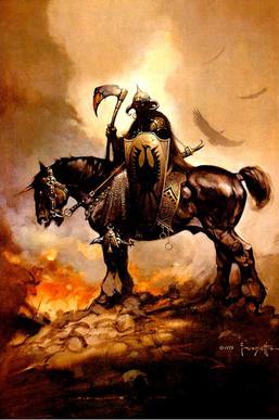


Dreamstryder wrote:
Well if you guys study art from 3e and 4e era, and now 5e....what you will notice is that in terms of detail and traditional art style, yes...5e is a step up vs amature/fan art/generic mediocre art, which is virtually the majority of what we have seen with 3/4e.
I would say starting with the sundering modules ( which are edition neutral I might add or setup that way ) that is leaning towards more of a professional style, I personally think it's a little too colorful still and the colors themselves have a bit of a plastic digital look ( similar to ghosts examples and I've seen many of these examples ), it's a texture issue an execution of technique I would say really, and digital is highly limiting in this department, or what I should say I've yet to see a digital painting that has the same kind of color texture and blending look that traditional hands on work does, it's hard to describe this to non artists and it's possible alot would not notice this.
A common example here is that alot of the brush effect looks of digital paintings look just that to a trained eye....they look plastic...they look fake...they seem like a something is not right copy/emulation of a real painting, I think this might be do the digital precise type effects you get from working on a virtual canvas vs working on a real one or tooth textured paper, things start to get lost or simply very different.
It also comes down to the fact that in the last 19 years or so, we have not been seeing the kinds of traditional art that we did in the 80s and 90s. Those artists still exist but for whatever reason they moved on ( possibly because TSR went bankrupt and WOTC wanted to slot in MTG type style along with the growing animU fad in north america ), so what we have is a "new generation" of mediocre artists who lack the originality and unique styles that the pros had, possibly because they are chea labor wotc sticks with them or because ( ding ding ) so many of them are typical in their style, it all fits with the low quality art direction and colorful animU hybrid style comic look that the kiddies love at their local manga shops that also sell MTG etc.
I personally think 5e art is a better choice in direction, if it actually leads to say some rare artist coming along who is on par with the old pros, but I have doubt's that is going to happen for alot of reasons.
1 The pro fantasy king artists of the 70s-90s come from an era where people learned traditional hands on art, some people still learn that today of course but that is not the direction it seems these kinds of companies are going in.
2 Those guys learned things that most kids and uni students are NOT being taught, these days anyone is told they can be an artist or to do this art because its cool and they become a one trick pony cookie cutter artist like we see in 3e and 4e.
3 After so many years unless your getting paid big bucks ( even then sometimes you pass I know I would ) you become bored of doing that kind of art or you wish to branch off and do things on your own or work with more freedom.
4 With so much push in style towards colorful bland comic animU style art and it's trendy phases in north america, along with it influencing younger people...it's easy to see why people pass up finer quality art and to develop a personal style that is unique to them. What I mean by this is elmore, easlley, caldwell and parkinson all did traditional detailed realistic paintings that had and captured fantasy atmosphere, other than that...you could pretty much look at any painting they did ( in some cases drawings ) and instantly recognize who drew it by their unique style.
When I flip through 3e and 4e books 95% of the art looks the same, it looks like fan art or an amature dabbling in digital design on deviant art, there is almost no pieces that instantly make me go wowwww that is damn fine, it's almost all filler type quality art that I would personally expect in one of the indy rpg companies from the mid 90s, like white wolf or someone or fasa etc who lacked the kinds of funds that tsr had to hire the pros.
I've felt this way since 3.0 came out even the logo was absurd and cheap, 4e logo is OK but it still falls flat vs 1e and 2e people had a vision and knew what design was along with pro art, everything is just too similar today and lacks the kind of style and originality that existed back then, it extends to many things today I can't count the number of crap stock covers that ereader books have now, it's always some ugly boring scenery photo on a white cover with big boring font, sorta like the ugly modern furniture too boring white walls blocky furniture...people are paying for that crap...in some cases big bucks, people today simply lack class, taste and aesthetics.
I think 5e itself may take off in time and I might even give it a shot for ravenloft and fr since its default setting, the art I can live with I just wish someone at WOTC would take the design team aside and say "ok guys...we need to pull up...lets crack out the old books and take some pro tips here.....get to work....lets make d&d what it was, a great game with great art and design". When I look at all the 5e covers I say....hmm yes they are a step up in terms of being pro art, but its a bit too modern slick what I actually have the biggest problem with is the fact the covers design layout is almost "Downs" and lack the kind of design features that lets a customer know "this is THE fantasy rpg and what a fine quality product this is". If I was on that design team the instant I saw the short name d&d upper logo and the redundant full name small I would have said WRONG remove this and remove that, and do it much better...work harder and give it alot more thought and class, I would have suggested classy borders or things to put on it that makes it have more atmosphere, instead it looks like someone painted a bunch of comic covers from 2005 in better detail than the artists wotc got the last 10 years.
That would easily get my hard earned money, instead I just look at this continuing mess with alot of face palms and yawns, people are profoundly incompetent though.
A modern example ( and probably digital but executed with atmosphere and the design and presentation obviously had thought put into it...so some people are still doing a decent job ).

Vaegard wrote:
More examples...these guys today...I would put money down they could not paint or detail things to this level of talent and craftsmanship to save their own lives if put to the test.


Ghost I think you are talking about the FILLER ink illustrations that were in 2e, to that I agree that those filler artists were that...filler artists, some of them on par with 3/4e inside but the difference was most of the art in 2e was illustration or ink work, with color plates or covers.
However someone who was truly amazing and not a filler artist was stephan fabian who did the black n white illustrations in the ravenloft products, although they eventually stopped that probably lack of money cause I noticed a huge dive for interior art near the end of 2e life.
Not cherry picking anything, the majority of 1e and 2nd e covers...from about 1981 ( or whenever those new editions of 1e came out with easley art not the original crap covers ) and till possibly 1994 tsr had top notch cover art by all the pros, at the end its true they took on some filler cover artists and had some stinkers but it was far from the norm, seems like they reserved what high selling products were left near their nail in the coffin with the pros still.
I can't think of a single 3e or 4e piece that comes close, I would love to see you give some official examples though from these 2 editions cause I own most of 4e books ( yes I'm a huge fan of 4e it brought me back 3e art and designed turned me off outright ), but even there I can think of...hmm...the shadowfell cover stands out quite quality, ummm....not much else I can think of....ok the orcus cover of mm is pretty decent too.
Vaegard wrote:
On a side note:
Not all art in the TSR era was good either, but I sure miss turning the leaves of a D&D book and seeing something like that:


I'm talking about cherry picking the few paintings and covers out of the enitre body of 2e. Dark Sun was THE first setting i got into in DnD and bought a ton of it. The Brom stuff was great and there were a few of his black and white pieces scattered throughout but a vast majority of the stuff was baaaad. Pretty much anything Baxa made my eyes bleed.
I'm looking through the PHB and there's tons of corny stuff. I have one of the monster manuals and it's full of stuff like this

Yes, folks. Think about this when you complain about the art in 3e, 4e and 5e. This is how the monster manual art used to look in 2e.
But that's probably a pretty bad example. Let's look for more.

Ehhhh....

Uhhh....

Errr....
And this is what i'm talking about when people bash 3e/4e/5e art and then turn around and pick out the .001% of the amazing painting in 2e to prove their point. You had entire books absolutley filled with this kind of stuff. If they released a 5e book now and all of the art was from the old 2e interior artists, the internet would explode over this. Nothing in 3e/4e could be considered "amateur" next to a majority of 2e's interior art (i.e. most of the art in the system overall).
Oh that is 2.5 I think...I only skimmed through that at a buddies when it came out, I agree 2.5 interior books were crap but again that was late tsr/death days.
Original 2.0 rule books actually had a semi norse/celtic style border and art design, even had some of jeff's illustrations in blue ink and the rest was all pro paintings.
Most people seem to be iffy on the 2.5 books, for a number of reasons haha but yea some of those are a bit sketchy although they are more like drawings than anything, I happen to like some of the illustrations in MM2 from 1e though for some reason those little boxes seemed to give off alot of vibes even though they were basic ink work.
Who I really miss is that amazing map maker from 2e I think it was dale sutherland III that guy was amazing also that other guy Stephan from dwarven forge his map and illustration work from the 80s was pure ace talent, I think honestly back then people just had alot of passion and drive towards this game vs today. Peoples imaginations were alot more open too.
SF...such an underated guy who not too many know other than those back in 2e ravenloft, aint no interior filler artist if only WOTC could hire someone like this to do consistent quality interior work.

As I said, not every art in the TSR era was awesome. There was plenty of "filler" art in the books too.
But every once in a few pages you would see something really amazing and in the overall it was enough to fill one with wonder and plunge into that fantasy world you were reading and imagining.
3e/4e art also had a whole lot of horrid filler art, but did not have the amazing art 2e had on the other hand. At best it had some nice drawings here and there, but nothing awe-strucking as the art of the pros who worked on the TSR books.
5e is already much better than 3e/4e from what I've seen so far, but still not on par with those awesome drawings of 2e.
GhostStepper wrote:
Vaegard wrote:
dmgorgon wrote:
Could we please have the decency to not use the term 'pro' to refer to people whose art we like and 'amateur' to refer to the ones whose art we don't like? The definition of 'professional' is 'someone who gets paid for their work' and the definition of 'amateur' is 'someone who doesn't get paid,' and everybody whose art appears in a D&D product has (one would hope) been paid for it, quality work or not.
If you absolutely must convey the full extent of your adulation and/or scorn, at least call them 'masters' and 'hacks', respectively
Rastapopoulos wrote:
The best 2nd ed art and Elmore/Easley tends to blow away most modern art IMHO. And by modern I mean 3rd ed, 4E and Pathfinder. Good art in TSR era was usually cover art and some B/W stuff though the 2nd ed MM for example the interior is bad.
Most of the TSR era hard covers from 81-95 or so were Easley work as well at least the generic books. Dragonlance was argueably defined by Elmore, Darkson was Broms baby and I think they designed it art 1st and followed Broms concept sketches.
I have been liking a lot of the 5E art though alothough some of it is bad. Proportions look great, weapons and armor look realistic. The cartoony/animie art is mostly Pathfinder hardbacks, to good PF art is the APs and Wayne Reynolds usually is not the cover artist. I can't really stand his work from the 3.5 Eberron cover through to Ultimate Campaigns in Pathfinder. WAR work defines PF though love it or hate it. WAR also did some reasonable Darksun art for 4th ed IMHO.
If you could take Tylers art with Pathfinder AP art that would be very good. All versions of D&D are gonna have crappy art. The best of the best though was probably 2nd ed but that is cherry picking 2nd eds best work. Some interiors were bad. The main problem with the art in the post abve mine is that it is technically very good but almost all battle scenes. Older D&D art often made you think about things or had people in non combat situations (on the cover). Getting very bored with battle scenes no matter how well done.
Easley

More Easley

Still more Easley

And he did all of the 2nd covers for 1st ed for the MM, MM2, PHB, DMG, UA and IIRC OA as well, not sure about the WSG/DSG. Easley more or less defined D&D for a decade and a half I suppose. I went from the Rules Cyclopedia to the 1995 2nd ed printings after reading the 1st ed books with Easleys art on them so for me D&D art= Easley with side helpings of Elmore, Brom and Caldwell.
Disagree still Ghost...I think alot of others do too...there is just nothing that has the lasting impact and fine quality visual power like the old hands on art.
There is some "decent" new art for sure in some of these examples but frankly alot of it looks like cgi renders almost. I really don't think anyone is going to cherry pick any of these 10 or 20 years from now and go "hey guys remember this cover wasnt that the most epic" where as anything from the 80s or 90s you will have alot of "oh yeaaaa I remember this amazing elmore or easley cover from my childhood" and there is a reason they did the red box and picked that cover for 4eE release it's not hard to figure out ~.^
And yes....the new starter is a laugh compared to the original, I understand the "nod" but it's a whole other world of style ( although it's a huge step up vs 3/4 )....not my thing, it's not a bad cover but has no selling power on me at all other than for the dice maybe it does not even come with a map heh.
I just had to buy the FR player's guide ( got it cheap only reason since I wanted it for my colleciton ) for 4e last night, anyway I think the adventures and other player's 2nd ed guide will be remembered, somehow most of these 3/4e books I have feeling it will be a dead silence response sorta like the sony e ceo ridgeeeee racer response was.


GhostStepper wrote:
Look at the superb excellent excuted use of generic font ( they could not even be bothered to use the new stripped down cheap fr logo ) and atmosphere guyz it looks so narut0 this is going to leave me total fond memories of what the realms are....
All joking aside I actually liked the spellplague but this cover is....yea...

On the flip side the PB was a pretty decent attempt...has a good old school vibe going on.

Zardnaar wrote:
As the fan of the traditional art,i find those old 1/2 ed covers fantastic. There are lot of very good art in those books. Especially Ravenloft/Dark Sun. 3rd ed had some hit and miss art,but nowhere near as epic as those before. And then 4th came out. I just don't like it. Not that it is bad,but it is different. Not my cup of tea. I'm kind of sad to see that 5th will use digital art. From what i have seen in these preview threads i have to say that i really hope those are not finished pictures. In the end,even if i end up hating artwork,i can always use older edition art and be happy.
On the side note,if you read comics,you can also see that lots of modern comics have digitalised art too. But i bet it would be fun to see what would hapen if they give Spelljammer or Planscape in the hands of someone like Juan Gimenez or Enki Bilal (sadly,Moebius is not among living any more).
GhostStepper wrote:
ChrisTheS wrote:
I liked the 2e monster manual art, maybe I was the only one. But I liked that it was just a color sketch of the monster.
Paraxis wrote:
Meh
when Van Gogh painted, the traditionalists did not like it. Picasso is still shocking to some, you may or may not like the style, but that does not make the art bad. There was some hood art in the early stuff, but overall I think the art has improved. Some of the early stuff looks a bit stylized and cartoony to me, especially 1st ed stuff. But it's a matter of taste. I'd not let the art influence my decision.
Besides none of its Rembrandt.....
Jbickley00 wrote:
There is a flip side to that, some people actually enjoy feces....some do not. You can showcase a dogs turd in a baroque golden frame, at the end of the day though it's still a turd.
Chaosmancer wrote:
Haytam wrote:
It's different when it's done on purpose.
Apparently. Although I was forced to sit through a pointless biopic on Pollock in art history class and I still don't understand what he was attempting to convey. Maybe the emotional torture that 'true artists' put themselves through rubs off on the canvas somehow and you can't actually appreciate it unless you're looking at the original, or something...
Those pictures that look like dots where you have to unfocus your eyes, and then it's a sailboat?
THAT'S ART! We need more of that in the Monster Manual.
GhostStepper wrote:
I generally like the 5e art a lot. I would also argue that even if you don't love it, there is less to be explicitly irked about than in 4e (oversized silly weapons) or 3e (Mialee). That said, even if the art is repellent to you, you won't notice it after the first couple read-throughs. After all, how many times will you need to consult the Races chapter after character creation?
You can always print Brom art into post-its and glue them over all the art you dislike. 
Vaegard wrote:
DemoMonkey wrote:
docdoom77 wrote:
docdoom77 wrote:
Rastapopoulos wrote:
A few more. 15 Years of Easley more or less being on everything that mattered.

Easley
More Easley
Still more Easley
More or less covered all the core books, the 2nd monster manuals and the 1.5/2.5 UA and Players Option books. I forgot to include the 1st ed UA as well. Not sure how ye olde art compares these days to new art if you missed it the 1st or 2nd time.
Zardnaar wrote:
Chaosmancer wrote:
Rougher strokes are called "painterly". Minute inspection of Easley pieces can reveal speckles from photographing the paintings or the canvas texture, but at the scale the art is printed, I think color detail will be more noticeable than texture. See this cover. Despite the 4e-like costume, I know it's 2e from the layered colors.
Comparing Skills and Powers and the 5e DMG, whose covers have the same general scenario and color scheme, the main difference may just be that the DMG (and other 5e covers shown at this time) are more focused on a single color: MM = electric blue, PH = red-orange, DMG = purple (Easley's works use color contrast too, but are a bit more prismatic in their balance). Tho' not as prismatic, here's some Easley-like art that might be 5e.
Rastapopoulos wrote:
Larry Elmore, I think. Easiest way to identify a piece of his is to check if all the highlights are coming from the same direction - he has a better sense of scene-based lighting than others (who tend to light like a photo studio).
Vaegard wrote:
Kitiara has most of her clothes on and doesn't have massive breasts but you can tell she is a female. These days it probably means no good.
Zardnaar wrote:
I love the 5E artwork and I love that bit of "Disney" touch it seems to have. I hope that they take all of this art work and make really good animated features with it.
I understand there is a CGI version of FR for artwork uses. I hope that rumor is true.
In my opinion, the art of 1st/2nd edition AD&D was best. I though the majority of 3rd/4th edition art was horrible. So 5th edition art, while I don't think what I've seen so far compares to 2nd AD&D art, I feel it's a VAST improvement over 3rd/4th art. And I think Pathfinder is the absolute worst of them all.
I'm just not a fan of disproportionate bodies and body parts. The same goes for armor and weapons. I like to see practical, proportionate art. Weapon sizes that would give Cloud Strife weapon envy, and armor pieces, such as shoulder pauldrons, that would pop your head like a bad zit if you were to raise both hands above your head just look silly. I hate art that is too cartoony. And though I am a fan of a few anime movies and series, I hate seeing it in D&D art.
So yeah, in my opinion, 5th edition art is a VAST improvement over 3rd/4th edition art, which had too many of the above listed elements that I hated.
Zardnaar wrote:
I like the art of Larry Elmore and Keith Parkinson. I didn't play 2E, but Parkinson's art lured me into EverQuest, and, through the magic of the Internet, I was able to see his earlier stuff. But for every Elmore, Parkinson and Ross, you had loads of people whose pieces were relatively unskilled or pedestrian. In the same way, with digital art, you've got loads of people that are relatively unskilled, but then you've got your Echo Cherniks and Marta Dahligs who can pull incredible art out of a computer.
I love Echo's Shadowrun work--so much so that I bought her first Kickstarter art book and the Shadowrun book (I missed the second kickstarter she did, as I was out of work at the time). I'd love to see her do some D&D stuff, too.
Also, a request. If you're going to refer to anime- and manga-inspired styles, please use the word "anime." "Animu" makes you sound like a pretentious prick. Thanks.
Since we're being pedantic anyway, 'anime' refers only to moving images...
I am quickly falling in love with the new art. It is gritty and invokes a sense of the fantasic living along side the mundane. I find it very inspiring thus far. Daddy likey- Me want more 5e. Jacobson and Jones illistrations. This art Rocks my Socks!
thewok wrote:
That is exactly correct Azzy In all fairness though I use it over all those types mucking about on DA, I use wet canvas these day's it's where the "big boys" play and real art happens, vs the furry animU childrens games, wannabe photographers who have 2k nikons from dads plastic and shallow people who write bad poetry and dreams of granduer types thinking japan will hire them for doing thousands of rip off bad jobs of real anime skilled work.
Vaegard wrote:
hunterian7 wrote:
The majority of 2e ( and even some of 1e ) was mainly 80s comic style art, sometimes typical illustration. The covers howerver and the layouts were better in terms of overall design and quality.
3-5 is quite amatuer design and art, it looks no different than sterile DA digital art that is fantasy, this is not original or in any kind of league of what d&d is and that fact it is a professional product...not some run of the mill thing and that's my point. Again SOME of the art for 5 is a step up but its still a far cry from traditional fine quality original art that we used to see.
I would totally expect this from an INDY publisher or someone lacking money, someone who just branched into the publishing world.
You will almost always have crappy/sub par interior art, all editions are guilty of this, but this is WOTC and it's D&D....I expect more from that, luckily I never pay full retail and never would I buy most of them at 35% off with free shipping, if I was faced with full price I would mostly likely pass and simply use "friends" editions.
I know a ton of people who also feel this way towards comics after about the late 90s, there is however still some good artists there they are also mostly from the image side though or who were part of the marvel super team of the early 90s who all formed image, most who came after ended up copying their highly detailed and original styles.
I'm not just ragging on WOTC here but many companies and designs chosen today, imo and many others...its cheap...its utter crap and in no way a reflection of the passion and thought put into past works, people adore feces it seems and some don't I sure as hell don't and will speak my mind over it just like others have a righ to speak their mind over anything.
I don't respect digital art, I consider it junk just the truth and a skilled true artist who is well rounded and original will always have my respect, because they are rare and I disregard and reject the modern worlds view on art, it's vomit to me and its worthless, there is also no originals with digital files so good luck trying to sell it in the real world to art collectors. Sure you might get paid big bucks working for some pc design concept digital art, still does not impress me one bit.
People with talent and originality do.
docdoom77 wrote:
Vaegard wrote:
Far from it, I'm a spiritual person that values quality traditional art, dark spirituality and music in many forms along with unique and intelligent things, when it comes to people I'm quite misanthropic and have no value for the mundane and society. When it comes to art I even respect SOME abstract that is creative. Digital has always looked plastic to me and has always lacked something that traditional art does not.
I am however greatly against the modern world and reject it, including religion and politics and the disgusting worthless aesthetics today compared to the works of beauty that europe used to create for example.
I've yet to see any digital art that rivals traditional, and it's possible one day I will....the reality is though it takes far more skill and talent to work on paper or canvas vs a pc screen.
I'd really rather see 1e-style cartoons return:

Qmark wrote:
Vaegard wrote:
For the record, I totally dig the 5e art.
Do what I did with 4e, which is to try to find the positive in the art and a justification for the rest that that is terrible. Take for instance all the art by O'Connor. I think he does a great job of adding character to most of the pieces, but I despise the proportions and overall shoddiness of over 90% of his work in D&D. I've seen some exceptional pieces by him, so I know he has the art chops; he just didn't use them for the majority of D&D. I justified it by attributing it to a very tight-knit deadline schedule (he did a huge part of most of the books). So I survived 4e and now am moving on to greater things with greater art.
Edit: embarassing typo.
AaronOfBarbaria wrote:
DP
1st ed art tends to get a free pass. If it looks liike it was drawn by friends of 2 guys in a basement it was because it was drawn by friends of 2 guys in a basement.
So, I just got my starter set and seeing the art first hand, I have this to say: A-frickin'-mazing!
It's awesome. I love it to death. All the armor looks realistic and functional. The weapons are not over-sized (or not by much where they are) AND the layouts are exciting and fun. I love it!